Voltionz
Typography and Social Media | 15 Week Project | Fall 2021
What is Voltionz?
Voltionz is a healthy potion designed to give you a volt of energy without ever overwhelming your body with unhealthy chemicals.
Shocking to shelves 2022.
The Ask
Design a brand where the typography reflects the energy and spirit of the brand.

Brand Identity
The brand identity links energizing yellow and orange colors with a typeface that gives a sense of motion and direction.


Logo, Font, and Color
Our target audience is health-conscious adults and college students. Using bright colors like yellow and orange, paired with black and white, gives a youthful and energetic vibe to our brand.
I designed the logo based on the font Niveau Grotesk and was imagined to have motion and action when the viewer looks at it.
Campaign
Social Media
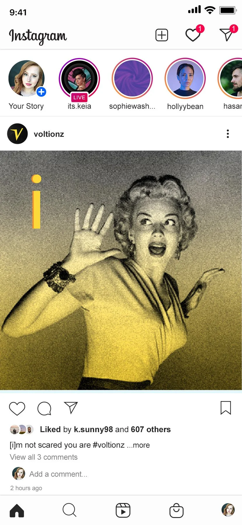
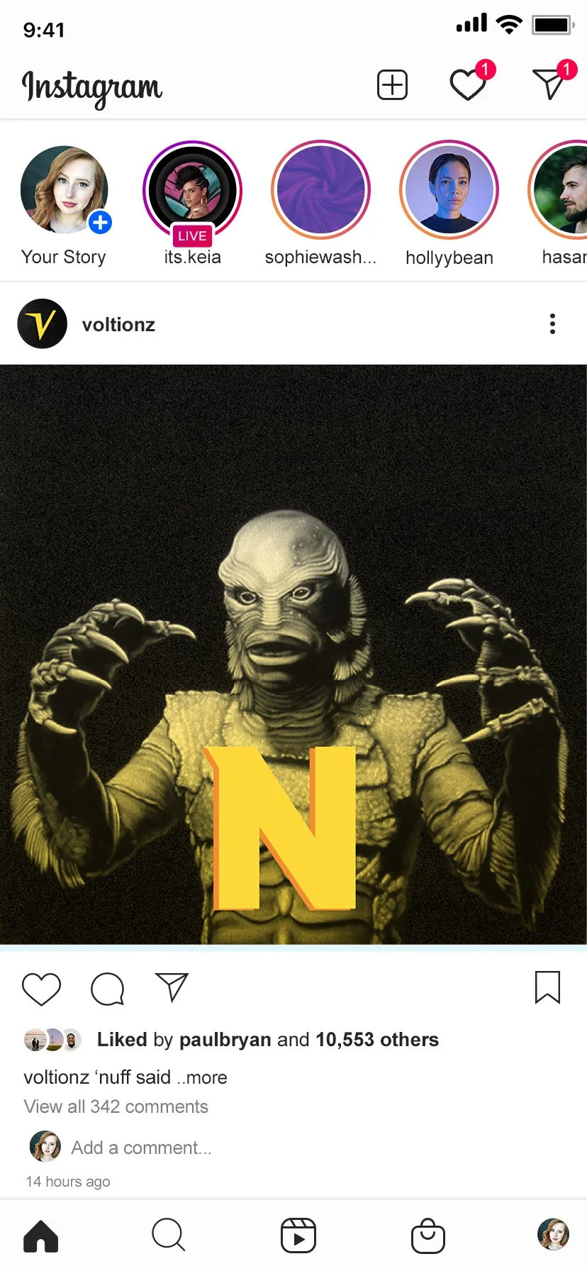
Voltionz uses 1950s horror movie imagery to create an electrifying social media presence.
The client wanted the social media to spell out the brand name in a series of Instagram posts and have the caption play on the letter featured.

Packaging
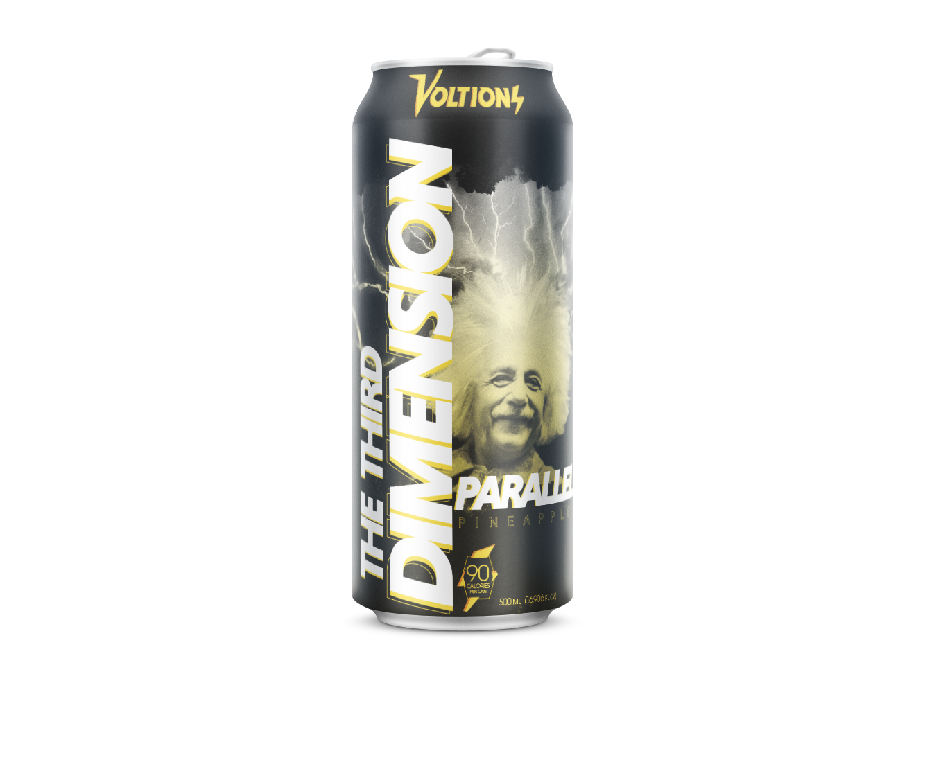
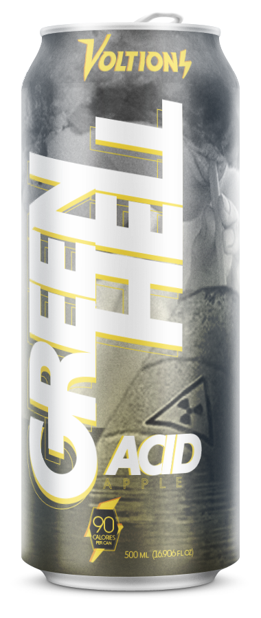
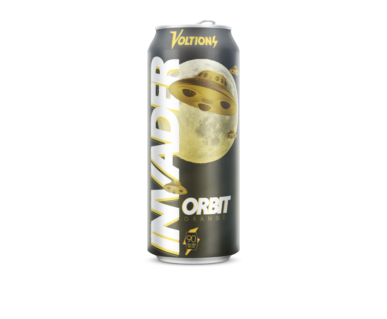
The energy drink packaging was inspired by 1950s horror, with each drink designed to have a different effect.
Far Far Out, for example, is great at keeping you awake during an all-nighter, while Atomic is helpful for exercising.


Media
Voltionz launches onto the scene with this explosive and electric cooler. This color references the various characters seen throughout the social media and drink branding.


